
OVERVIEW
The information architecture on our resource and training page was not clear and led to user fall off.
Making filters available for search and introducing the training schedule as a calendar view improved conversion.
ABOUT ECI
ECI Software Solutions provides business management software for small to medium-sized businesses for industries like manufacturing, distribution, and construction.
ROLE
UI/UX Designer
TEAM
Victor Camara - Head of Analytics & Digital Marketing,
Samuel Austin - Front-End Developer
Steve Neumeier - Data Analyst
Nathan Rich - Creative Director
Kendra Mitchell - Senior Designer
PROBLEM
Employers buy software without employee training.
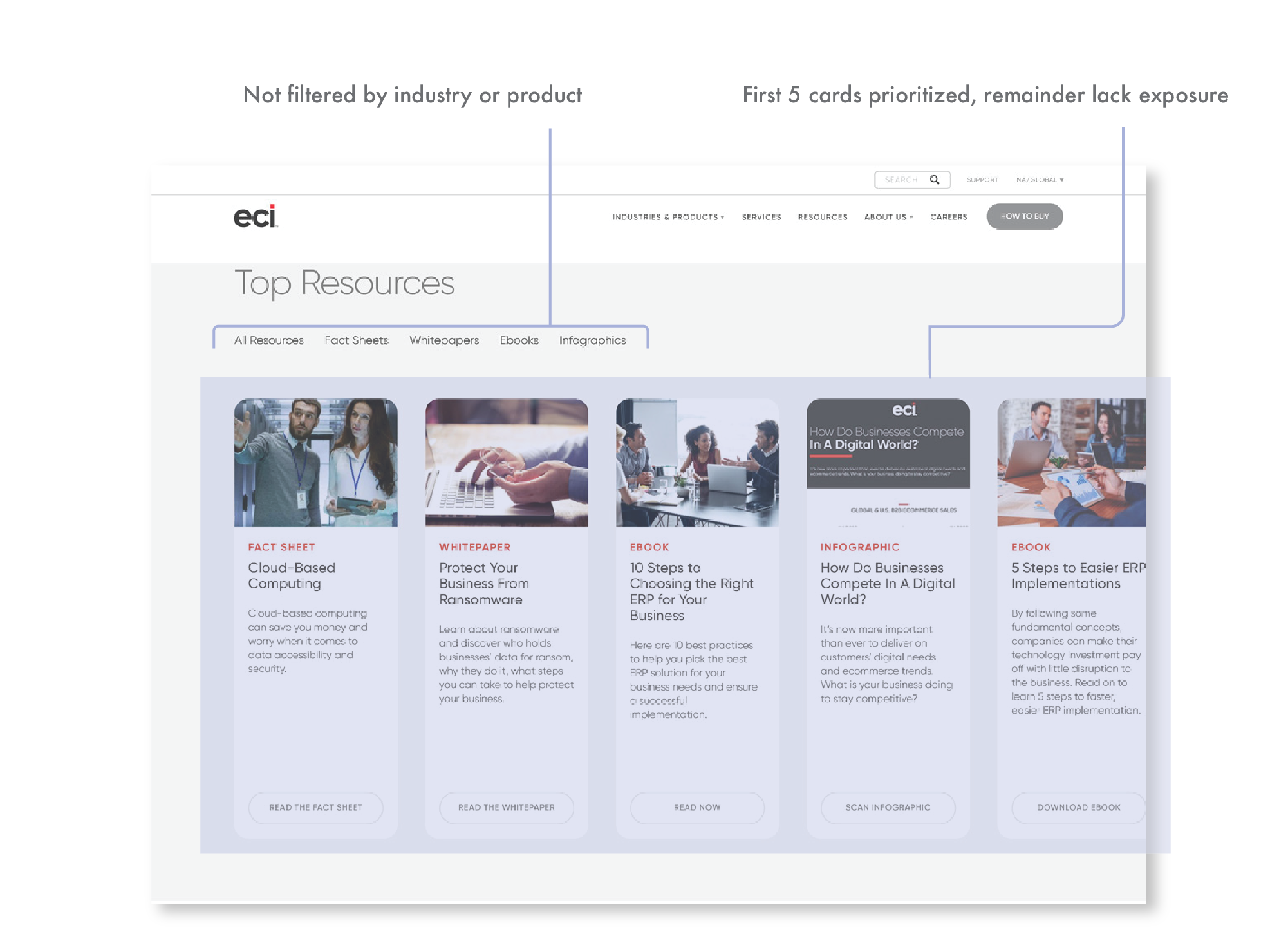
Our clients wanted to educate themselves more about our products, the previous resource page showed a lot of user fall off. This abandonment interrupted the flow, resulting in lower conversions when the user tried to purchase the add-on training enrollment.
Before: Training Course Syllabus
Before: Resource Page
MY ROLE
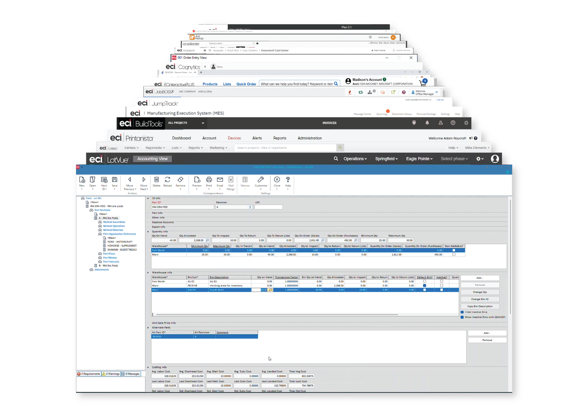
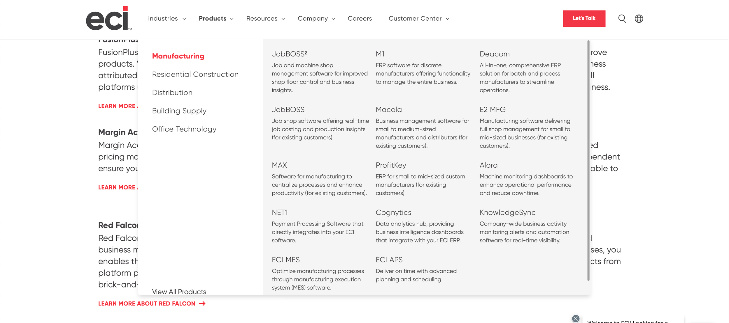
Organize ECI’S gigantic product portfolio.
I joined the team during a massive rebranding overhaul. Collaborating with my design team of 6+, we revamped the webpages for our clients’ (new and returning) to have an easier time accessing information about their preferred tools.
Contributions: Information Architecture, Lo-fi/hi-fi wireframes and prototypes, Email Design, Web Audits
RESEARCH
Employers are lost among ECI’s 60+ diverse B2B products.
Filters were put in place to simplify searches across product resources.
Our user flows led to an easier enrollment and ensured employees were better equipped to engage with the software, improving ECI’s conversion rates.
IDEATION
How might we connect ECI’s products and training courses?
I developed multiple concepts, incorporating the filters and category tags for a simpler flow. Restructuring the information to be more functional for enrollment.
A couple of developer and stakeholder constraints were the ability to market multiple date and times on one class page/component and to be capable of scheduling multiple courses.
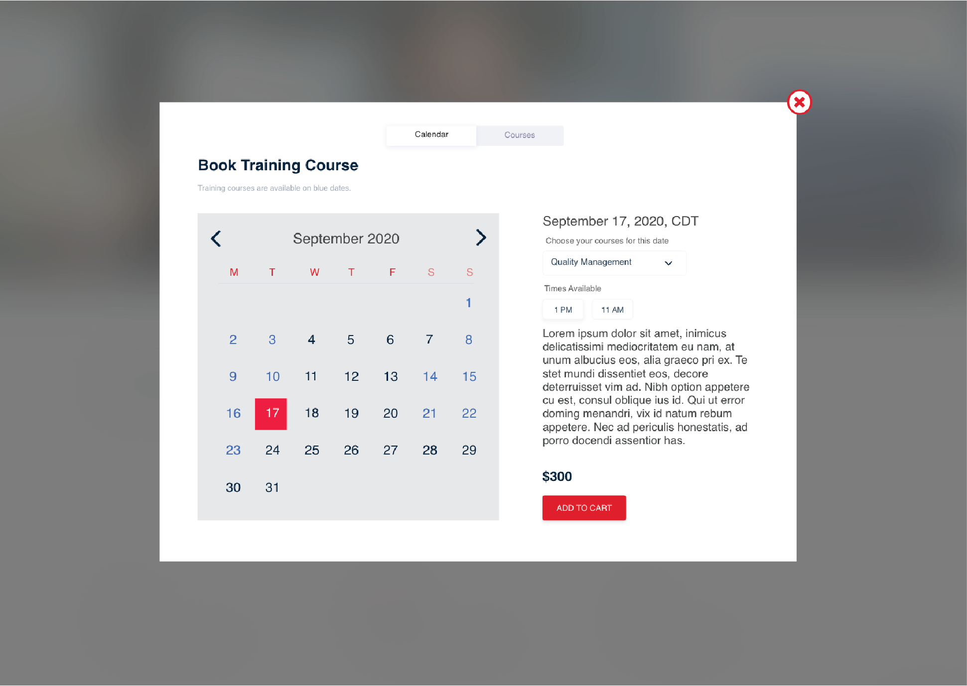
Final Design
A calendar for product classes.
Previously, ECI didn’t have filters to specify the search on their product resources and had a long list of information to schedule and enroll their clients’ employee training on the products.
The shortened user flow for both features reduced confusion, cut down abandonment, amplified conversion for ECI and led to more training course sales.
Training Course Calendar
Resource Page
LESSONS LEARNED
Beyond the Launch.
Order Review - Although scheduling was made more clear, I would have wanted to put some focus on the purchase section. Redesigning the option of editing class times and dates in this section would have been more clear.
Simpler paths to access the actual manufacturing training courses would have been my next step. The courses though mentioned in the resources, remain somewhat hidden in another section of the main navigation.