Vortexia - Investment Tracker

Responsibilities
Visual Design, Wireframing, Prototyping, User Research, User Testing
Timeframe
June 2024 - Mid September 2024
Project Goal
We’re creating an investment tracking portfolio app to help experienced investors track their portfolio across their diversified assets in one application.
Target Audience
Experienced investors that keep track of all their investments actively
Tools
Figma, Miro, Google Meet
Key challenges and constraints
Narrowing down our audience
Focusing more on the user’s personal portfolio
Making it clear that our application wasn’t another brokerage account but specifically an investment tracker
Research Conducted
5 Initial interviews - empathy map
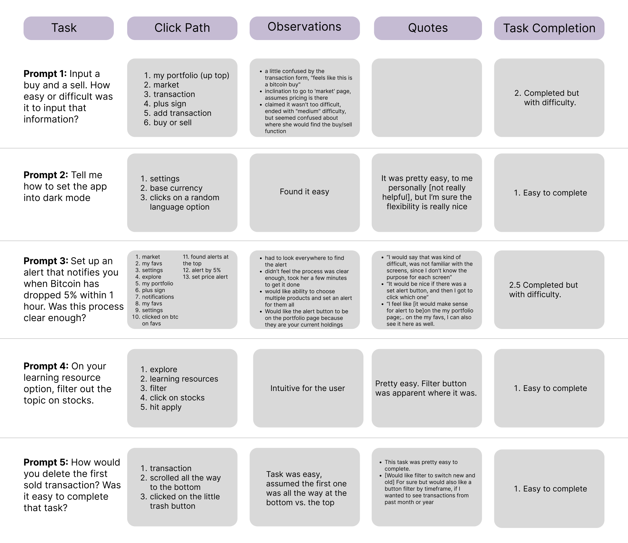
3 lo-fi usability studies
3 hi-fi usability studies
4 final hi-fi usability studies
Initial Concepts / Design Strategy
We wanted to design an app that tracks your diversified assets (crypto, stocks, ETFs), be able to set financial goals, follow a watchlist for future purchases, be able to see the live market, have the ability to track your transactions, and keep yourself informed through reliable finance resources.
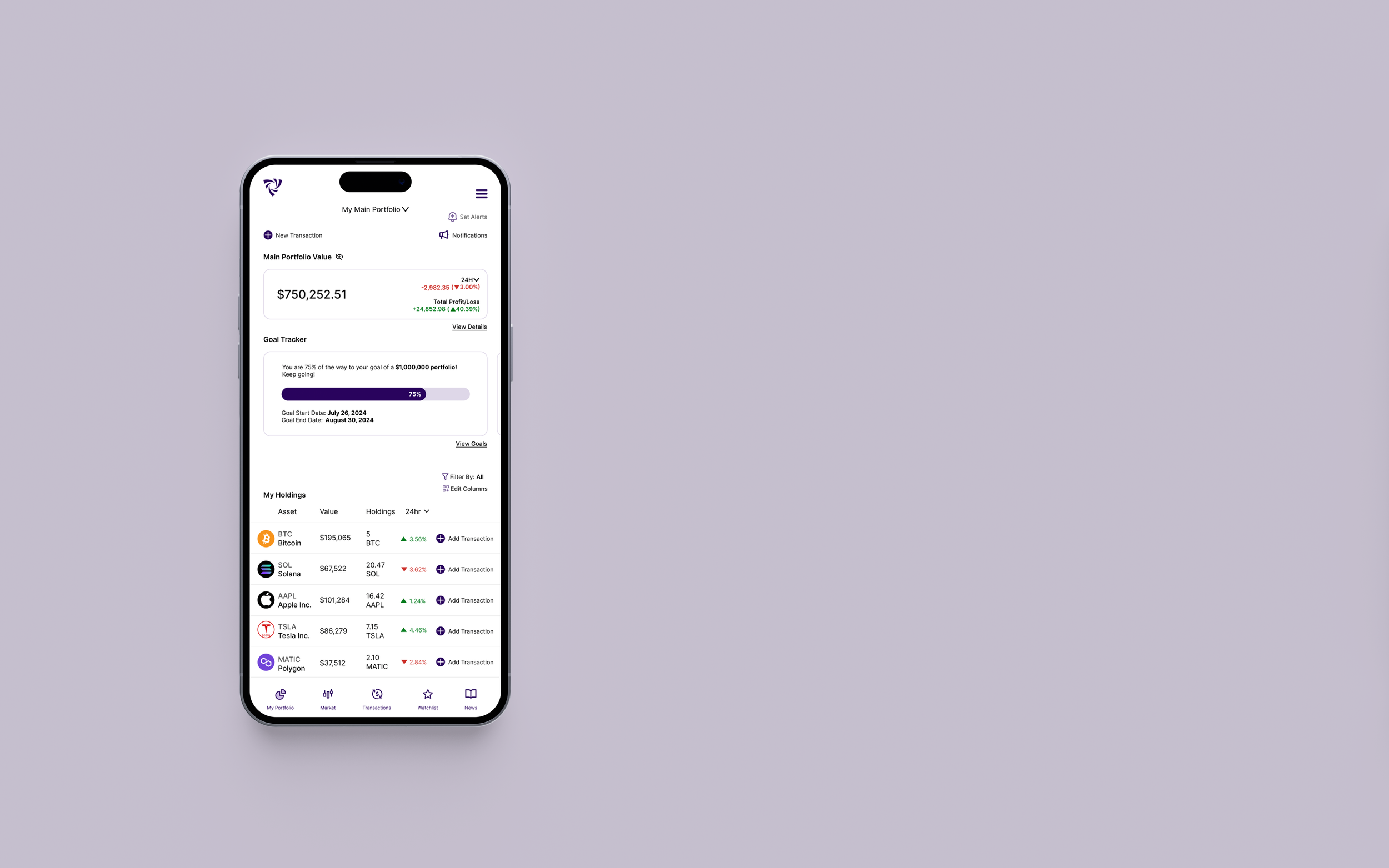
Homepage Design Before & After


Empathizing with the User
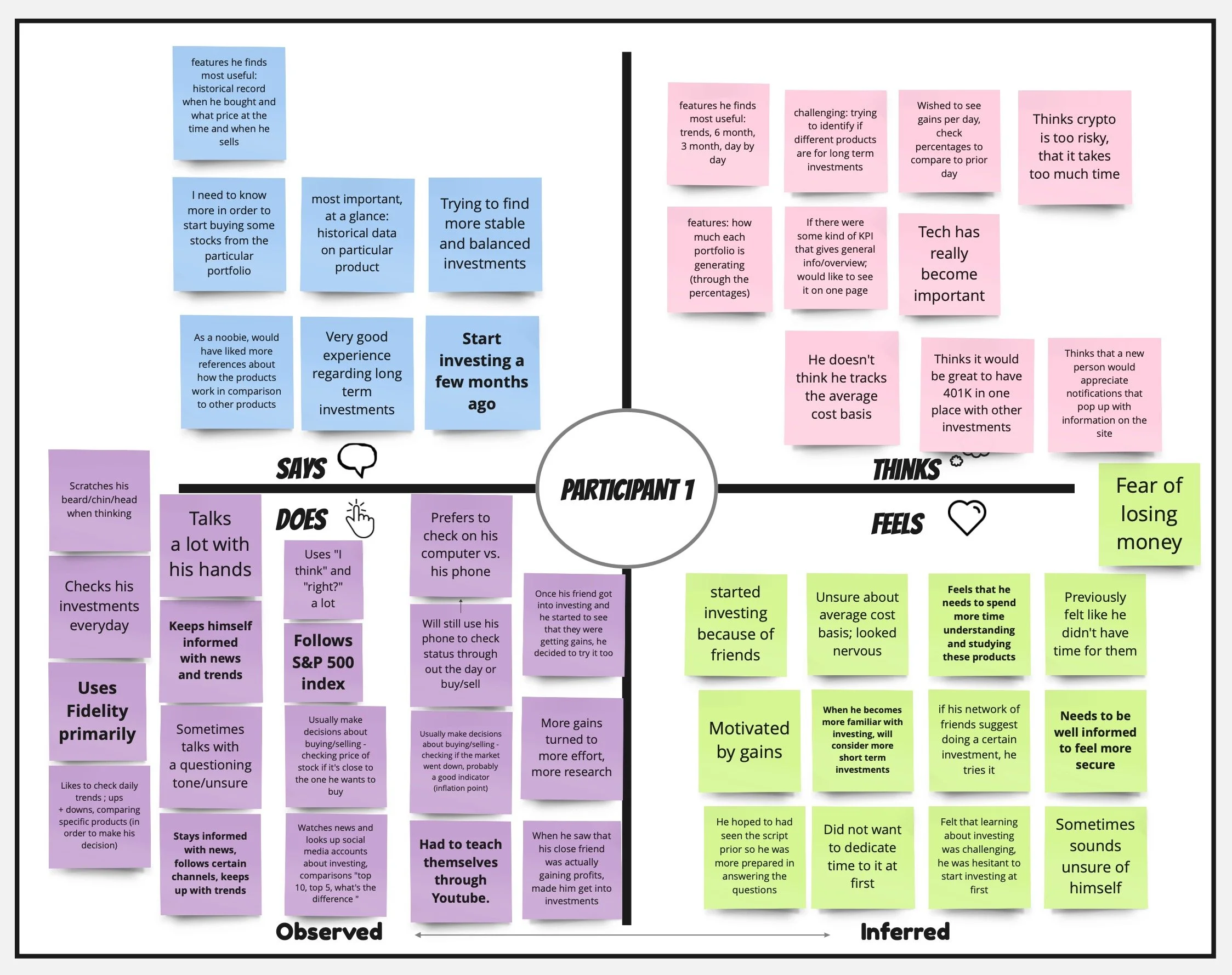
Empathy Maps
We built empathy maps with the information we gathered from the initial interview participants to become familiar with their wants and needs for this investment tracker application.
Personas
We then built personas from the common points we found in the empathy map data.
Key Findings from User Interviews:
All participants found it helpful to have all their assets tracked in one place, since most competitive apps would just track crypto.
Most of our participants like to stay informed with the latest financial news to determine their next steps for handling their assets.
Some users wanted a UI that was less overwhelming, but detailed enough to know certain data points at a glance
Defining Concepts & Ideation
Competitive Analysis
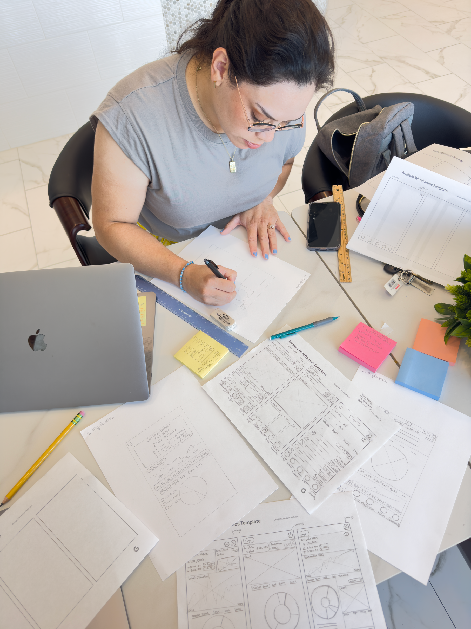
Rapid Sketching
From the interview data we received and the competitive analysis we ran, we sketched out multiple versions of the six main screens and took note what features we thought would serve best for the user.
We gathered that the user would mainly run through these type of screens:
Main Portfolio - User would be able to see their portfolio value at a glance, check out their personal holdings and have the ability to set their goals
Watchlist/ Favs - Be able to follow assets of interest (whether they have bought it or not)
Market - Have the ability to see the general market and be able to compare different assets
Transaction History - Ability to input their transactions and keep track of how much was bought or sold over time.
Community/News - Keep themselves informed with relevant news on assets, finance, learning resources
Settings - Accessibility and customization abilities would be able to be set here, things like dark/light mode, color blind settings, language or preferred base currency
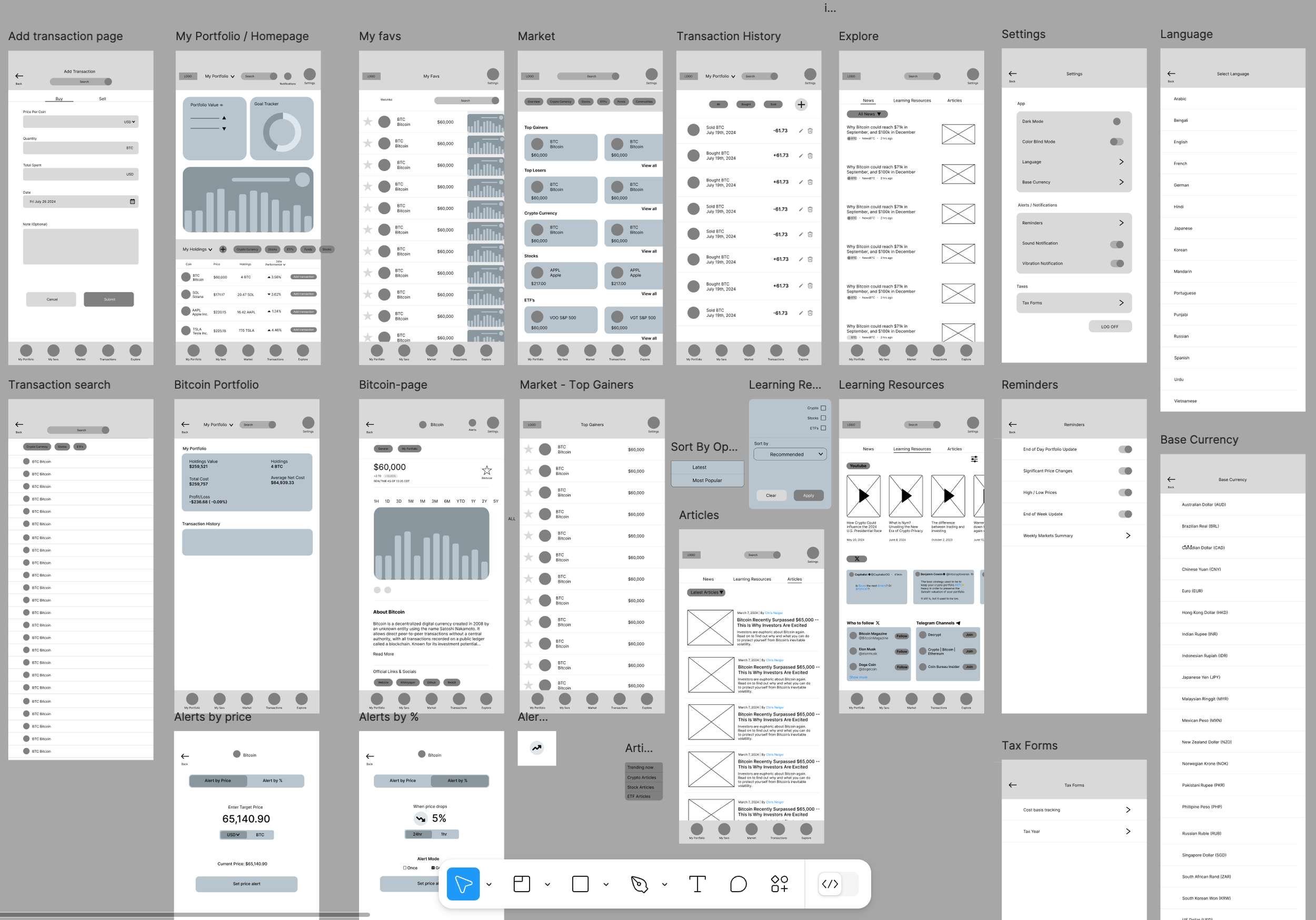
Lo-fi Digital Wireframes
Testing Prototypes
Lo-fi prototype
After creating our first digital lo-fidelity prototype, we had gone into our first phase of testing out the functionality of the application.
Lo-fidelity Prototype Results of User Testing
Pattern & Insight Identification - Lo-fidelity Usability Study Results
Refining the Design
Interactive Hi-Fi Prototype (Version 1)
Final Interactive Hi-Fi Prototype (Version 3)
